DESIGN PRINCIPLES - EXERCISES & PROJECTS

Neoh Kar Yan (0339338)
Design Principles
Exercises & Projects
INSTRUCTIONS
Final Project
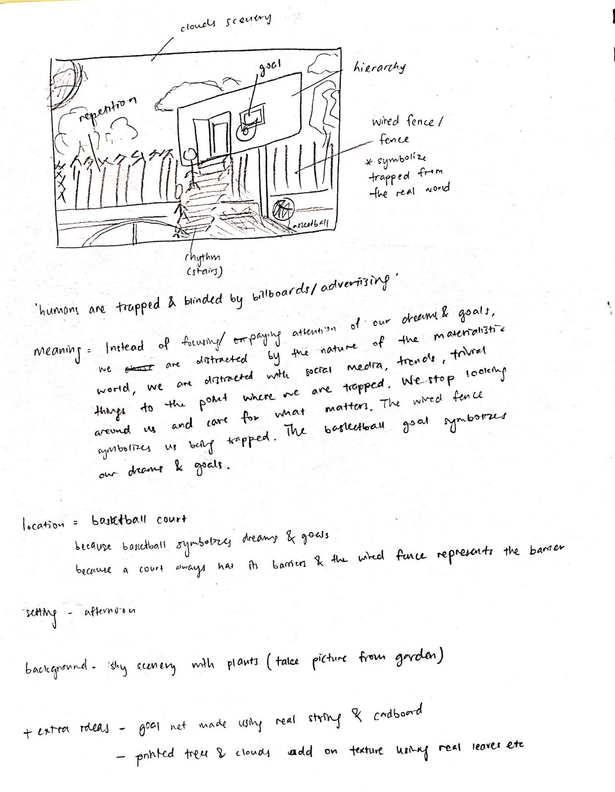
BILLBOARDS
26/6/19 - 3/7/19 (Week 14 - Week 15)
We were to observe and investigate the print culture around us. Wherever we go, we see billboards: on buildings, highways, elevated sidewalks. They are of different sizes, orientations and they all have been designed for a purpose.
 |
| Fig.1.1: Billboard #1 |
 |
| Fig.1.2: Billboard #2 |
 |
| Fig.1.3: Billboard #3 |
 |
| Fig.1.4: Billboard #4 |
 |
| Fig.1.5: Billboard #5 |
What I noticed from the billboards that I've observed, they all have similar styles and purposes, which is to promote a specific product, brand or a social cause. All the billboards I spotted were advertisements and they were found mostly in high-traffic areas and busy sidewalks. Even on campus, we can spot many billboards or print adverts around us. Adverts such as to promote the campus, food, club events or other upcoming events.
Generally, I am never attracted to the billboards in Malaysia. The billboards that attract me are usually digital and big screen billboards, billboards that come alive. Those, in my opinion, are what I find really interesting and appealing to the eye.
To start off, I did some brainstorming and came up with 6 different ideas and sketches for this project.
 |
| Fig.1.6: Sketches and ideas #1 |
 |
| Fig.1.7: Sketches and Ideas #2 |
I had a lot of ideas in mind. After sketching out and showing it to Ms. Sherry, she said that I have good ideas and that the idea that I pitched to her was clearer compared to the other ideas. Hence, I went with my last idea.
Having that idea fixed, I began to further my thought process and developed my overall ideas on it.
 |
| Fig.1.8: Idea development |
I decided to execute this project digitally on Adobe Illustrator.
 |
| Fig.1.9: References |
Here is my progress:
I started off digitizing the stairs with a stock photo I found. Then I copy and paste the first step to the next so it saves time.
 |
| Fig.1.10: Digitizing the stairs |
Next, I digitized the billboard and the door.
 |
| Fig.1.11: Digitizing the billboard |
I proceeded to add shadows and highlights to the stairs as it will look more realistic and it creates more depth to show more significance in the composition.
 |
| Fig.1.12: Adding shadows to the stairs |
Moving on, I placed a transparent image of a wired fence and digitized the floor.
 |
| Fig.1.13: Adding the fence and floor |
Moving on to my background, I was inspired by Ryo Takemasa's illustration on a green scenery that I really like. I wanted to use different mediums for this project. Hence, I wanted to paint my background using acrylic paint.
I placed a transparent image of a wired fence and digitized the floor.
 |
| Fig.1.14: Acrylic paint used |
 |
| Fig.1.15: Painted background |
After combining the background with the digitized artwork, I didn't really like the outcome because it didn't really fit well with one another. Therefore, I digitized the background.
 |
| Fig.1.16: Combined painted background with artwork |
 |
| Fig.1.17: Digitizing the background |
After digitizing the background, I added clouds that I drew myself. I also added a basketball under the billboard plus their shadows.
 |
| Fig.1.18: Adding background into artwork and basketball |
I traced different people and played with the colours of their hair, outfits, etc then placed them in the composition. The reason why I didn't add shadows to the people is because I didn't want to make the people stand out more than the basketball. Hence, they look more balanced with one another.  |
| Fig.1.16: Adding people |
 |
| Fig.1.17: Adding more people |
I added the phrase "*Inserts every ad" on the billboard with the typeface Futura Bold.  |
| Fig.1.18: Adding billboard message |
The Final Composition:
 |
| Fig.1.19: The Final Outcome |
People nowadays are constantly fixated to the screen of their respective gadgets, whether is it keeping up with the latest trends or chasing materialistic items. However, there are so many things that truly matter to us out there in the world for us to see, admire and care about. Hence, we should learn how to pause once in a while in our lives, to get off our gadgets, step outside and live a meaningful life.
In my composition, I applied several design principles. Firstly, the principle of hierarchy. I made the billboard on top of the composition with a dynamic perspective so that it stands out from the rest of the elements. I also made the word 'Advert' large enough to appear as the priority. Next, the principle of repetition. The fence and stairs are made repetitively. The white lines on the floor showcases direction as it guides your eye direction horizontally and vertically sideways down. I also showcased the principle of rhythm through the humans walking towards and up the stairs. It gives off a sense of movement towards the door. Lastly, I also made the billboard with black and white colours alongside with two other contrasting colours, orange and blue to showcase the principle of contrast.
Project 2
SENSE OF PLACE
12/6/19 - 26/6/19 (Week 11 - Week 13)I researched on compositions with a sense of place. Here are some of the artworks I found.
 |
| Fig.1.1: London Underground poster 1952, Edward Bawden |
 |
| Fig.1.2: Back streets, Porto Portugal. Karen Stamper |
I drove alone to my high school, SMK Seafield on a rainy morning and spent a good 2 hours there taking photos of every corner of the school. Thankfully, the staircases weren't locked and that I was able to climb up to visit my old classrooms.
 |
| Fig.1.3: School Logo |
 |
| Fig.1.4: Photo of my high school |
I chose photoshop as my medium for this project. To start with, I filtered out pictures that I can potentially use for this project then compiled them together in my desktop, to make the process of dragging into photoshop easier.
 |
| Fig.1.5: Pictures on my desktop |
 |
| Fig.1.6: Combining elements |
I began experimenting with positioning, size, blending modes and colours to create a visually pleasing collage.
Here is the process:
 |
| Fig.1.7 |
 |
| Fig.1.8 Adding a yellow gradient |
 |
| Fig.1.9 Adding the 1st background picture |
 |
| Fig.1.10: Adding the 2nd background picture then adjusting the opacity |
 |
| Fig.1.11: Adding extra elements |
 |
| Fig.1.12: Adding extra elements |
 |
| Fig.1.13: First outcome |
 |
| Fig.1.14: Second outcome |
Later on, one of my friends pointed out that there was a yellow line coming from one of the pictures which looked a little distracting, thus, I took her advice and returned to photoshop to remove it.
Here is my final outcome:
 |
| Fig.1.15: The Final Outcome, 'Seafield' |
My final composition aims to tell a story about the place which impacted everyone and myself who has gone through their high school years in a government school. I wanted to portray elements of nostalgia from my artwork. I also showcased design principles such as perspective from the buildings, hierarchy with my school logo on the top and rhythm with the building floors.
Each elements used has their own meanings:
1. The building floors with perspective on both sides focus their direction outwards from the roof of the school building. This represents the warmness and light which my school has given to me.
2. The signage 'Guru bimbingkan kami menuju kejayaan' means that teachers will always guide us to success. I totally agree with this statement. I wanted to put this element into the composition because I wanted to prioritize all the teachers who have impacted me and guided me throughout my school life. Without them, I may not have the success I have today.
3. The signage 'Bilik Disiplin' has a significant meaning to me. It is called the 'Discipline room'. It is the room of all the discipline teachers. I was a school prefect throughout my high school life. When I was in Form 5, I was the secretary for the prefectorial board. Hence, I used to work in the discipline room every single day for a year and a half. I helped teachers to sort out documents, meeting minutes and all things paperwork. For most people, 'Bilik Disiplin' to them is a scary place. Reason is because for students with any wrongdoings, they will be called to the room and get punished by the teachers. It is a familiar place for all students with poor behaviour. Yet for myself, this room is a place of growth, learning, and responsibility.
All in all, this artwork is titled 'Seafield', the name of my high school. I am grateful for this place, it has taught me a lot, and it brings back all the good memories. Definitely, It has a place in my heart and I hope my artwork brings out the sense of this place from my heart.
FEEDBACK: Ms Sherry thought it was nice to work on a place which has a meaning to me. Some of my classmates agreed that there were alot of perspective going on and they liked the clear hierarchy shown from the school logo.
Project 1
SELF-PORTRAIT29/5/19 - 12/6/19 (Week 9 - Week 11)
For our first project, we were to create our own self-portrait. We had to show who we are in the self-portrait but it doesn't have to be a literal translation of how we look like; it can be non-literal. We were free to use any mediums and techniques for this particular project.
To start off, I started brainstorming on what I want to potray in my self-potrait. I wanted to make it non-literal and non-conventional to what a self-portrait would look like. As I reflected on my values and my personality, I realized that I'm a very family oriented person.
Hence, an idea popped in my head. I wanted to convey a message which is, I am who I am today because of them. I visualized having a collage of all of my family members' faces combined as one, which still resembles me. Here are the sketches of my idea.
After printing pictures of my family members and myself, I tore them into pieces. I went for the tore method because the outcome would look a little vintage and raw. After tearing, I proceeded to assemble them. One downside of my progress is that I couldn't use my sister's photo because it was too dark. Nevertheless, I went on working with only my parents' photos. Below is the process of the making of my collage.
Here is the final composition of my self-portrait. As mentioned above, I wanted to portray me being the person of who I am today is because of them, not just my physical appearance, but more of myself as a person today.
In terms of physical appearances, genetically, I've inherited my father's short eyebrows and my mother's smile.
I added watermelons into the collage because I am obsessed with watermelons. I've always loved watermelons. Whether is it the taste, the look, the colour or the vibe that it exerts, I love everything about it. Somehow it represents my personality in a way. I associate watermelons with happiness, thus it reflects on my jovial disposition.
I've also added leaves and elements of nature into the collage. I love seeing nature and I love to be surrounded by greens. It makes me calm and serene.
In conclusion, this collage is meant to project a heart-warming emotion to viewers. It reflects on my family-oriented, fun-loving, warm and jovial personality.
FEEDBACK: Ms Sherry said that it looked really nice and my classmates said that it was really touching.
To start off, I started brainstorming on what I want to potray in my self-potrait. I wanted to make it non-literal and non-conventional to what a self-portrait would look like. As I reflected on my values and my personality, I realized that I'm a very family oriented person.
Hence, an idea popped in my head. I wanted to convey a message which is, I am who I am today because of them. I visualized having a collage of all of my family members' faces combined as one, which still resembles me. Here are the sketches of my idea.
 |
| Fig.1.1: Mindmap about myself |
 |
| Fig.1.2: Sketches of my idea |
 |
| Fig.1.3: Inspiration |
After printing pictures of my family members and myself, I tore them into pieces. I went for the tore method because the outcome would look a little vintage and raw. After tearing, I proceeded to assemble them. One downside of my progress is that I couldn't use my sister's photo because it was too dark. Nevertheless, I went on working with only my parents' photos. Below is the process of the making of my collage.
 |
| Fig.1.4: Assembling the original photo of myself |
 |
| Fig.1.5: Combining parts of my family member's facial features |
 |
| Fig.1.6: Pasting of leaves |
 |
| Fig.1.7: Pasting of watermelons |
 |
| Fig.1.8: The Final Outcome, 'Who I Am Today' |
Here is the final composition of my self-portrait. As mentioned above, I wanted to portray me being the person of who I am today is because of them, not just my physical appearance, but more of myself as a person today.
In terms of physical appearances, genetically, I've inherited my father's short eyebrows and my mother's smile.
I added watermelons into the collage because I am obsessed with watermelons. I've always loved watermelons. Whether is it the taste, the look, the colour or the vibe that it exerts, I love everything about it. Somehow it represents my personality in a way. I associate watermelons with happiness, thus it reflects on my jovial disposition.
I've also added leaves and elements of nature into the collage. I love seeing nature and I love to be surrounded by greens. It makes me calm and serene.
In conclusion, this collage is meant to project a heart-warming emotion to viewers. It reflects on my family-oriented, fun-loving, warm and jovial personality.
FEEDBACK: Ms Sherry said that it looked really nice and my classmates said that it was really touching.
LECTURE 8: HARMONY, MOVEMENT & RHYTHM
29/5/19 (Week 9)
Rhythm is repetition or patterns. A pattern has rhythm but not all rhythm has patterns. For example, a piece may have rhythm if it makes your eyes travel from one place to another.
- Linear elements
- Alternating elements
- Gradation
- Repetition
 |
| Fig.7.1: Example of rhythm |
Movement is the design element that creates an impression of action which operates in the fourth dimension which is time.
There are a few variations of movement.
- Visual flow - moves from object to object by placement/ position
- Directional movement - placement of dark and light areas which moves your eyes
 |
| Fig.7.2: Example of movement |
 |
| Fig.7.3: Example of harmony |
 |
| Fig.7.4: Inspiration #1 |
 |
| Fig.7.5: Inspiration #2 |
EXERCISE
For this assignment, we were allowed to cut paper either from magazines, newspapers or even coloured papers. We were also allowed to make a collage for this assignment.
For this exercise, I challenged myself to work with magazines. Hence, I went ahead and bought myself a magazine to get started as I don't have any at home.
 |
| Fig.7.6: Magazine that I used |
I decided to create a collage that showcases the principle of harmony. I cut out elements from the magazine then pasted them on a background. I played with warm tones for this composition such as pink, orange and red. Here is my progress:
 |
| Fig.7.7: Process of collage |
 |
| Fig.7.8: The final outcome |
FEEDBACK: Ms. Sherry said that my artwork does have harmony in it based on the colours and the use of the circles. She also said that it looks very put together and balanced although the borders weren't as proportional, which is very difficult to do. Lastly, she mentioned that she finds it interesting upon the subject matter with the girl standing on a ball and the girl being stuffed with a hat.
VISITATION TO ILHAM GALLERY
(29/5/19)
When I first step into the building of Ilham gallery after almost an hour of a car ride, the first thing I noticed was the impressive architecture; built with sleek glass windows and black sky-high interiors. Even the unique elevator buttons got me fascinated.
 |
| Fig.7.7: Exhibition gallery guide booklet |
 |
| Fig.7.8: Chia Yu Chian: Private Lives exhibition |
 |
| Fig.7.9: Chia Yu Chian's painting |
From the paintings, there were a few design principles that I was able to point it out. Most of them had a sense of contrast in terms of the colours used in the paintings, different perspectives and a lot of line elements used. In my opinion, his paintings captured a lot of emotion from the people and the essence of Kuala Lumpur being the city life back in the days. I felt really inspired and was captivated by the overall mood of this exhibition, it was very eye-opening.
 |
| Fig.7.10: Rediscovering Forgotten Thai Masters of Photography |
To conclude the visitation to Ilham Gallery, I’m glad that I was able to have this opportunity to admire real works by real artists out there in the industry. It was an eye-opening experience for me and I’m extremely grateful for Ms Sherry and Ms Anis for this opportunity. I look forward to more visitations and off-campus experiences.
LECTURE 7: DOTS, LINES, SCALE & SIZE
15/5/19 (Week 7)
This week's lecture was prepared by my group (Chan Hee, Gordon, Min Ting and me). Four of us were delegated equally among four topics.
 |
| Fig.6.1: Presentation slides |
- Dots is the smallest element in design principles
 |
| Fig.6.2: Example of dots |
- Line happens when a point is extended to the other
 |
| Fig.6.3: Example of lines |
- Scale refers to the size of an object in relation to other objects in a design
 |
| Fig.6.4: Example of scale |
Size is defined as the physical dimensions or extent of an object
 |
| Fig.6.5: Example of size |
EXERCISE
For this exercise, I initially wanted to work on a mixed medium by having cut-out magazine papers, line drawing, and dots as well. However, I discontinued the idea and drew something simpler as shown below.
 |
| Fig.6.6: First attempt |
Frankly, I wasn't entirely satisfied with the outcome of my first attempt. Hence, I took another chance. This time, I focused only on one principle which is dots. I was inspired by orchids with a significant repetitive pattern going on their petals. I was thinking that maybe I could showcase it in my artwork.
 |
| Fig.6.6: Inspiration #1 |
 |
| Fig.6.7: Inspiration #2 |
 |
| Fig.6.6: The final outcome, titled 'Orchid of the west' |
LECTURE 5: HIERARCHY, ALIGNMENT, DIRECTION & PERSPECTIVE
8/5/19 (Week 6)
Hierarchy is the order in which a user process information
- Size, colour, repetition, whitespace, proximity, contrast, texture & alignment
Alignment is the placement of visual elements so they line up in a composition
- Edge, centre, horizontal & vertical
Direction is the elements in a design that guide the viewers' eyes from one area of the page to another.
- Horizontal, vertical & diagonal
Perspective is the tool we use to indicate depth.
- Relative size, colour, sharpness, point of view, overlapping objects, texture
EXERCISE
Initially, I was working on pictures from when I went to Korea. After clarifying, I realized that I wasn't allowed to use old photos and had to take photos specially for this assignment.
For this artwork, I wanted to create an overview of Taylors campus and make a little different. In this artwork, we see the word 'Taylors50' first as it forms a hierarchy. Then, we are able to see the rest of the objects in this artwork like the dog. I've put a lifebuoy on top of the dog to make it look like a rescue dog. Furthermore, the lines from the ground give off a perspective of direction as well as the buildings. Nevertheless, this artwork has the intention of telling a story, it is up to the viewers to how they want to interpret it.
 |
| Fig.5.1: First attempt |
Initially, I was working on pictures from when I went to Korea. After clarifying, I realized that I wasn't allowed to use old photos and had to take photos specially for this assignment.
For this artwork, I wanted to create an overview of Taylors campus and make a little different. In this artwork, we see the word 'Taylors50' first as it forms a hierarchy. Then, we are able to see the rest of the objects in this artwork like the dog. I've put a lifebuoy on top of the dog to make it look like a rescue dog. Furthermore, the lines from the ground give off a perspective of direction as well as the buildings. Nevertheless, this artwork has the intention of telling a story, it is up to the viewers to how they want to interpret it.
 |
| Fig.5.2: The final outcome, titled 'Taylors 50' |
FEEDBACK: Ms Sherry said that my artwork looks like an advertisement because of the heading and that the dog in the picture looks interesting. Usage of colours were also bright.
LECTURE 4: SURFACE, REPETITION, PATTERN & TEXTURE
24/4/19 (Week 4)
Surface is the outermost or upper most layer of something where any type of median is applied e.g: wood, empty, or knitted surface.
Repetition is when an element is repeated many times in a single design. Repetition works well with pattern and it creates a sense of unity, movement, rhythm and consistency within an artwork.
 |
| Fig.4.1: Example of repetition |
 |
| Fig.4.2: Example of pattern |
- Flow
- Branching
- Spiral
Texture is the feel, quality of a surface which we sense through touch like rough, smooth, soft, wet, etc.
 |
| Fig.4.3: Example of texture |
- man-made texture
- natural texture
- tactical texture (3D)
- visual texture (2D)
EXERCISE
 |
| Fig.4.4: Inspiration #1 |
 |
| Fig.4.5: Inspiration #2 |
 |
| Fig.4.6: Inspiration #3 |
I personally adore floral patterns. Seeing nature elements and their colours blending so well together creates such a sense of harmony in art. For this exercise, I've used a lemon, leaves that I've picked from my garden, chrysanthemum flowers, poster colour and some acrylic paint.
 |
| Fig.4.7: First attempt on pattern |
 |
| Fig.4.8: Second attempt on pattern |
 |
| Fig.4.9: The final outcome, titled 'Tropical citrus' |
 |
| Fig.4.7: Aftermath of exercise |
FEEDBACK: For the critique session of this exercise, we were asked to split an A4 paper into eight pieces. We were required to walk around the class and write comments to eight pattern designs. In total, I've received 11 comments on my final piece.
Most of them commented that they like the choice of colours as it gives out a fresh tropical feel. Some also commented that the artwork has good composition with nice use of space, textures. One said that the design would make a really good print, which Ms Sherry also complimented on my design that she would wear this pattern. However, one also made a constructive comment that although my artwork is beautiful and colourful, the repetition is not that clear in it.
FUTURE IMAGININGS TALK
20/4/19 (Week 3)
 |
We were to attend this talk which is organized by WREGA. This talk focuses on three professionals in the industry that are working on different specializations.

The first speaker was Keith Song, he does design on traditional medium which uses wires to make jewelry. His jewelry designs showcased were rather different and bizarre, not the ones that you can see in a standard jewelry store. Despite the tough circumstances that his field is going through, I genuinely appreciate the number of resources and dedication being put into his work and the brand.
 |
The second speaker was Chong Yan Chuah, whose work focuses on creating 3D environments. He showed us a video of his planet that he created which felt absolutely surreal and magical. I was awestruck by his work and creativity. The artwork and animation definitely did justice towards the message behind his video.

The final speaker was Paul Koh from Kezerk Innovation. His work revolves around a lot of interactive VR simulations such as holograms, VR sensory booster, interactive wall, rain room, light cave and many more. He also does advertisements for companies like Sephora and Prudential. I thought that his work was pretty interesting as it defines innovation today, how modern technology is used for different aspects in the industry.
Lastly, the talk finished it off with a Q&A session with the three speakers.
 |
LECTURE 3: SYMMETRY, ASYMMETRY & BALANCE
17/4/19 (Week 3)
We were informed by Ms Sherry to attend a workshop held by WREGA on 20/4. We were encouraged to attend the workshop to hear from different local artists and their works. Firstly, we started our first critique session on contrast. Ms Sherry commented that our class was phenomenal and our works were nicely done. Afterwards, we proceeded with the third lecture that was presented by group one (Wen yi, Daryl, Joe and Angelina).
We learned about 3 principles from this lecture:
- Symmetry is when the same elements are on both sides of the axis. There are 3 types of symmetries.
- Reflectional symmetry

Fig.3.1: Example of reflectional symmetry
- Rotational symmetry

Fig.3.2: Example of rotational symmetry
- Translational Symmetry/ Tessellation Symmetry

Fig.3.3: Example of translational symmetry
- Asymmetry is when the elements that are arranged on both sides of the axis are different.

Fig.3.4: 'Starry Night' as an example of asymmetry
- Balance is the distribution of visual weight of objects, colours, texture, and space in a composition.

Fig.3.5: Example of balance
EXERCISE
We are to create a composition showcasing one of the principles learned. We are only allowed to use watercolour for this exercise.

Fig.3.6: Inspiration for symmetry
I was looking through pictures of mandala art and somehow they reminded me of the ferris wheel, which is symmetry on both sides and similar to a mandala which is round.
- Symmetry is when the same elements are on both sides of the axis. There are 3 types of symmetries.
- Reflectional symmetry
Fig.3.1: Example of reflectional symmetry - Rotational symmetry

 |
| Fig.3.2: Example of rotational symmetry |
- Translational Symmetry/ Tessellation Symmetry
 |
| Fig.3.3: Example of translational symmetry |
- Asymmetry is when the elements that are arranged on both sides of the axis are different.
 |
| Fig.3.4: 'Starry Night' as an example of asymmetry |
- Balance is the distribution of visual weight of objects, colours, texture, and space in a composition.
 |
| Fig.3.5: Example of balance |
EXERCISE
|
| Fig.3.6: Inspiration for symmetry |
I was looking through pictures of mandala art and somehow they reminded me of the ferris wheel, which is symmetry on both sides and similar to a mandala which is round.
 |
| Fig.3.7: Sketch before watercolour |
For this exercise, I initially did it on a different material of paper. After painting with watercolour, the paper became very soft and it was difficult to work with. Therefore, I redid it on a watercolour paper which was thicker and a better quality to work with.
 |
| Fig.3.8: The final outcome of ferris wheel |
FEEDBACK: My classmates commented that I have a steady hand because the lines on the ferris wheel seemed really straight. Ms Sherry said that the ferris wheel appeared symmetrical and stable. Futhermore, she commented that the yellow base of the ferris wheel may be a little too bright that it feels like its coming out.
LECTURE 2: GESTALT
10/4/19 (Week 2)
This week, we were introduced to another design principle which is Gestalt. Gestalt is defined as an organized whole that is perceived as more than the sum of its parts. From my understanding, Gestalt images are perceived as a whole instead of the small details. It results in the brain and eye working together to perceive them visually, whereby the brain will automatically fill in the details for us. It's so interesting to see how two images can merge as a whole.
There are some principles when it comes to Gestalt, such as:
- Closure- we automatically fill in gaps between elements to perceive a complete image.
- Continuation- We follow and “flow with” lines.
- Similarity- We seek differences and similarities in an image and link similar elements.
- Proximity- We group closer-together elements, separating them from those farther apart.
- Symmetry- We seek balance and order in designs, struggling to do so if they aren’t readily apparent.
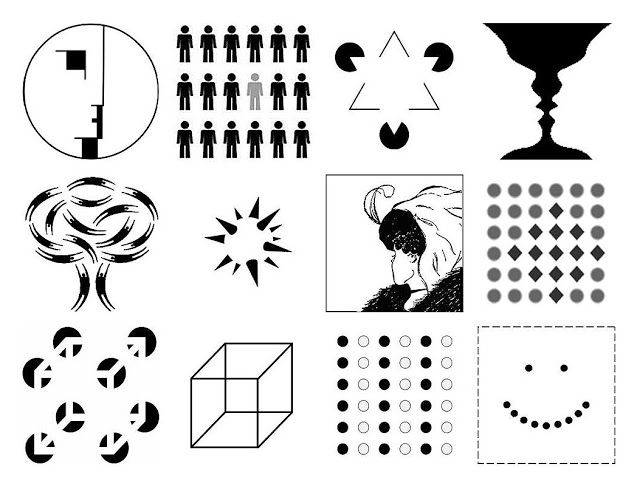 |
| Fig.2.1: Examples of Gestalt principles |
Ms Sherry mentioned that this will be her last lecture. Instead, we will be the ones to give lectures. We formed groups and picked the topic that we would like to cover. My group picked week 6 which covers the design principle about dots, lines and scales.
EXERCISE
For this exercise, we were told to create a design which showcases gestalt using only black ink on A4 paper. My piece was inspired by an illustrator's work while I was scrolling through Instagram for ideas.
 |
| Fig.2.2: Illustration by @Ameliaflower on Instagram |
The globe in this particular image caught my attention. It sparked to me that the shapes on the globe can be two faces. While I was sketching my idea out, I noticed that having a dog and a man's face can showcase a better composition and that It carries a significant meaning - Dogs are man's best friend. I have a dog at home called Max. Therefore, this idea carries a connection for me personally. That's when I decided to go with this idea. Before having this idea, I've already had several ideas in mind as shown as the sketches below.
 |
| Fig.2.3: Rough sketches and ideas |
 |
| Fig.2.4: Initial drawing with pencil |
 |
| Fig.2.5: Outlined the lines with black whiteboard marker |
 |
| Fig.2.6: The final outcome, ' Man's universal best friend " |
LECTURE 1: CONTRAST
3/4/19 (Week 1)
Here are some examples of contrast:

 |
| Fig.1.1: Examples of contrast |
We were assigned to create an A4 composition which showcases contrast using black and white paper.
 |
| Fig.1.2: Initial rough ideas for contrast |

Fig.1.3: Final idea that I went with
For my first outcome, I was inspired by the buildings of New York City. However, when I was sorting out my thought process, my eyes landed on the tissue box on my table. Ironically, the tissue box design has the design of Petronas Twin Towers. Then I thought why not I showcase it since I'm a Malaysian?
 |
| Fig.1.4: Final outcome, 'KL City' |


Comments
Post a Comment